


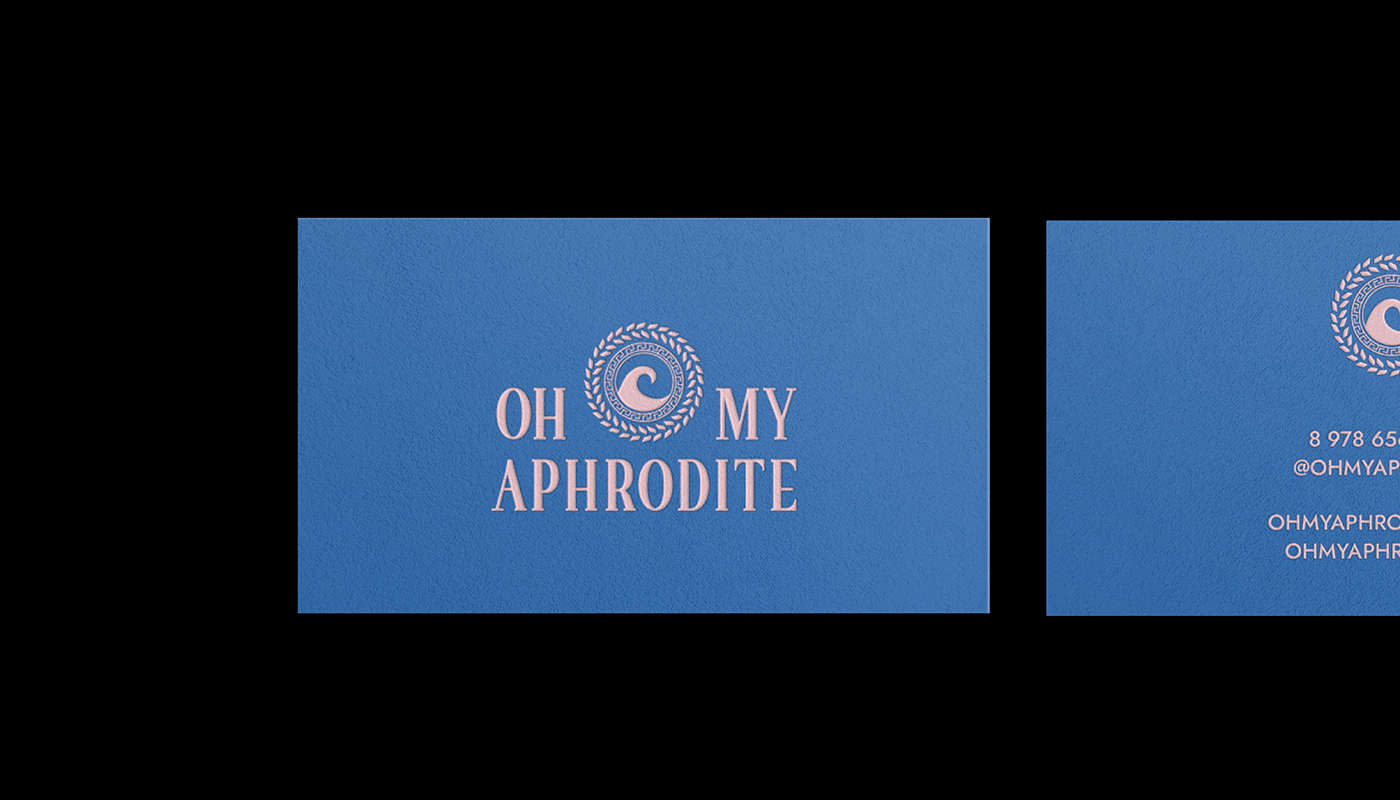
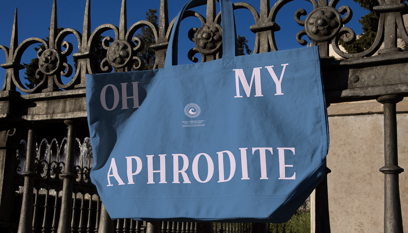
OH MY APHRODITE
Be yourself. Here and now. Pleasure, lightness, weightlessness.
Быть собой. Здесь и сейчас. Наслаждение, легкость, невесомость.
EN: A project to create a premium brand of women's clothing. The concept is saturated and inspired by the Greek goddess Aphrodite – the patroness of love, eternal spring and life.
RU: Проект создания премиального бренда женской одежды. Концепция насыщена и воодушевлена греческой богиней Афродитой – покровительница любви, вечной весны и жизни.

EN: The brand's logo is completely hand–drawn from scratch - antique with bar serifs. The bar type of serif emphasizes antiquity, strength and durability. The font has its own feature – a cut corner, which adds its own zest and character. There is a bright contrast in the structure of the font, which emphasizes the femininity and lightness of the brand. The elongated font and the downward-sloping connecting strokes emphasize the association with the premium. The palette of the project: juicy, gentle, calm, loud.
RU: Логотип бренда полностью отрисован вручную с нуля – антиква с брусковыми засечками. Брусковый тип засечек подчеркиевает античность, силу и стойкость. Шрифт имеет свою особенность – срубленный угол, что добавляет свою изюминку и характер. Присутствуется яркий контраст в строении шрифта, что подчеркивает женственность и легкость бренда. Вытянутый шрифт и опущенные вниз соеденительных штрихи ввызыввают ассоциацию с премиумом. Палитра проекта: сочная, нежная, спокойная, громкая.

EN: The brand's sign is the sea wave. According to legend, Aphrodite appeared from the sea foam.
A Greek-style wave is depicted here. The meander pattern is used in the usual form of a circle, a circle – trust and loyalty, eternity. The laurel branch does not contain a connecting branch, the leaves are arranged symmetrically, which emphasizes the modern style, adding its own zest and characterizing the "authenticity" of the brand. The shape of the circle reflects each girl that inside each has its own "storm" (wave) – calm, bright, cheerful.
A Greek-style wave is depicted here. The meander pattern is used in the usual form of a circle, a circle – trust and loyalty, eternity. The laurel branch does not contain a connecting branch, the leaves are arranged symmetrically, which emphasizes the modern style, adding its own zest and characterizing the "authenticity" of the brand. The shape of the circle reflects each girl that inside each has its own "storm" (wave) – calm, bright, cheerful.
RU: Знак бренда – морская волна. По легенде Афродита появилась из морской пены. Здесь изображена волна в греческом стиле. Узор меандр использован в привычной форме круга, круг – доверие и лояльность, вечность. Лавровая ветвь не содержит соеденительную ветвь, листики расположены симметрично, что подчеркивает современный стиль, добавляя свою изюминку и характеризую "подлинность" бренда. Форма круга отражает каждую девушку, что внутри каждой есть своя "буря" (волна) – спокойная, яркая, веселая.


Thanks for watching!
For cooperation – anestylla.com


